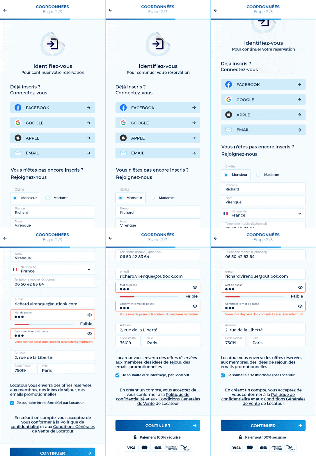
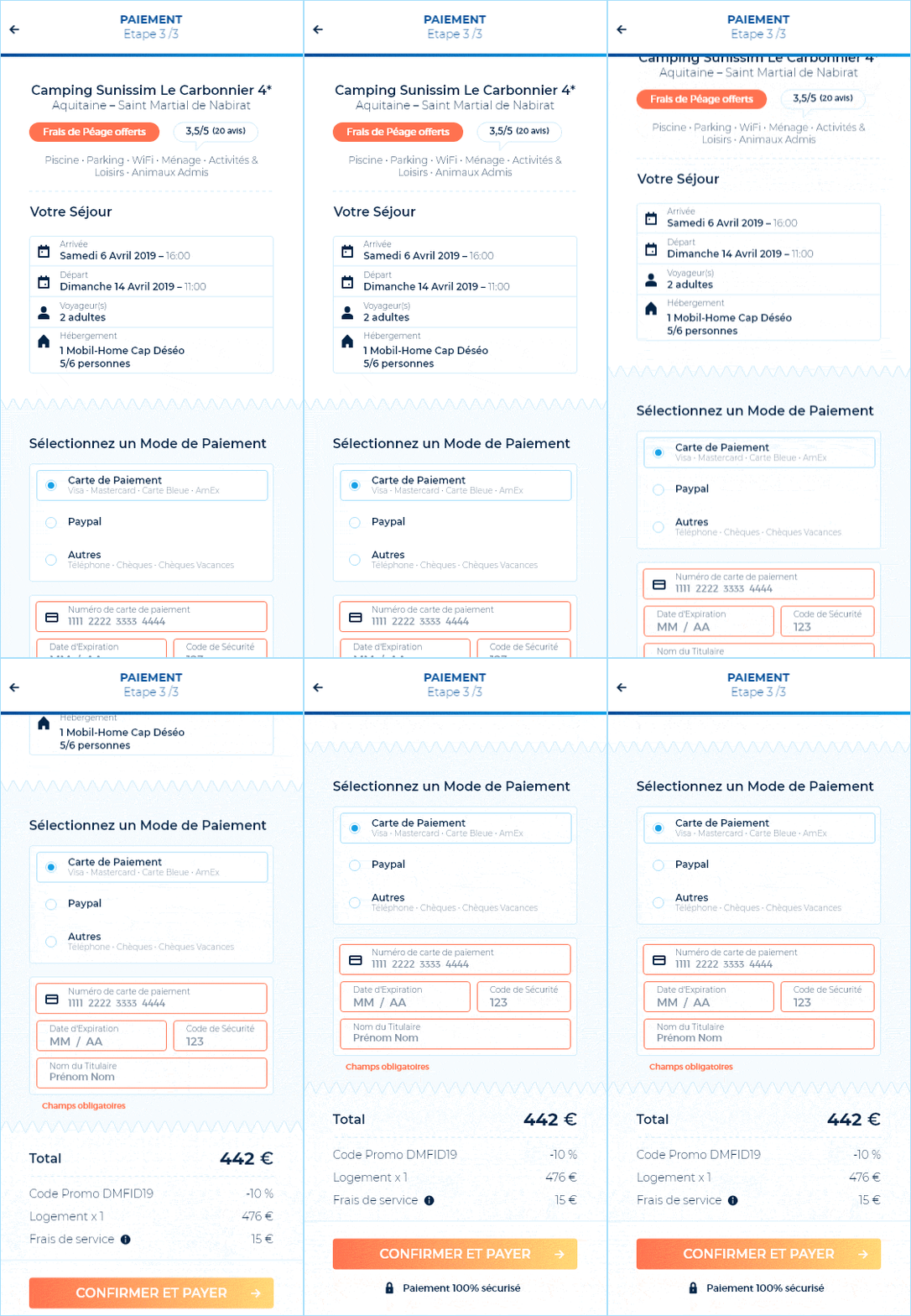
A Customer-Centric
Booking ExperienceFrom mountain to seaside or countryside, Locatour offers an extensive choice of holiday stays everywhere in France at attractive prices. With the emergence of price comparison tools, today's customers tend to be more autonomous in their search. Locatour must therefore continuously experiment, adapt and innovate to respond to their needs beyond purely economic considerations.
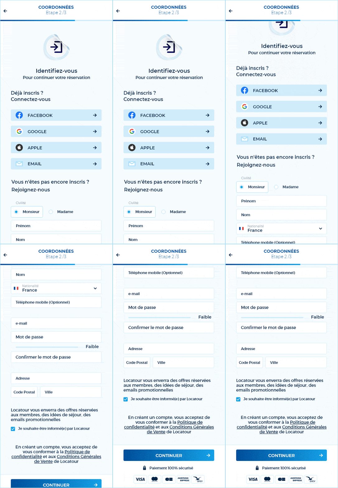
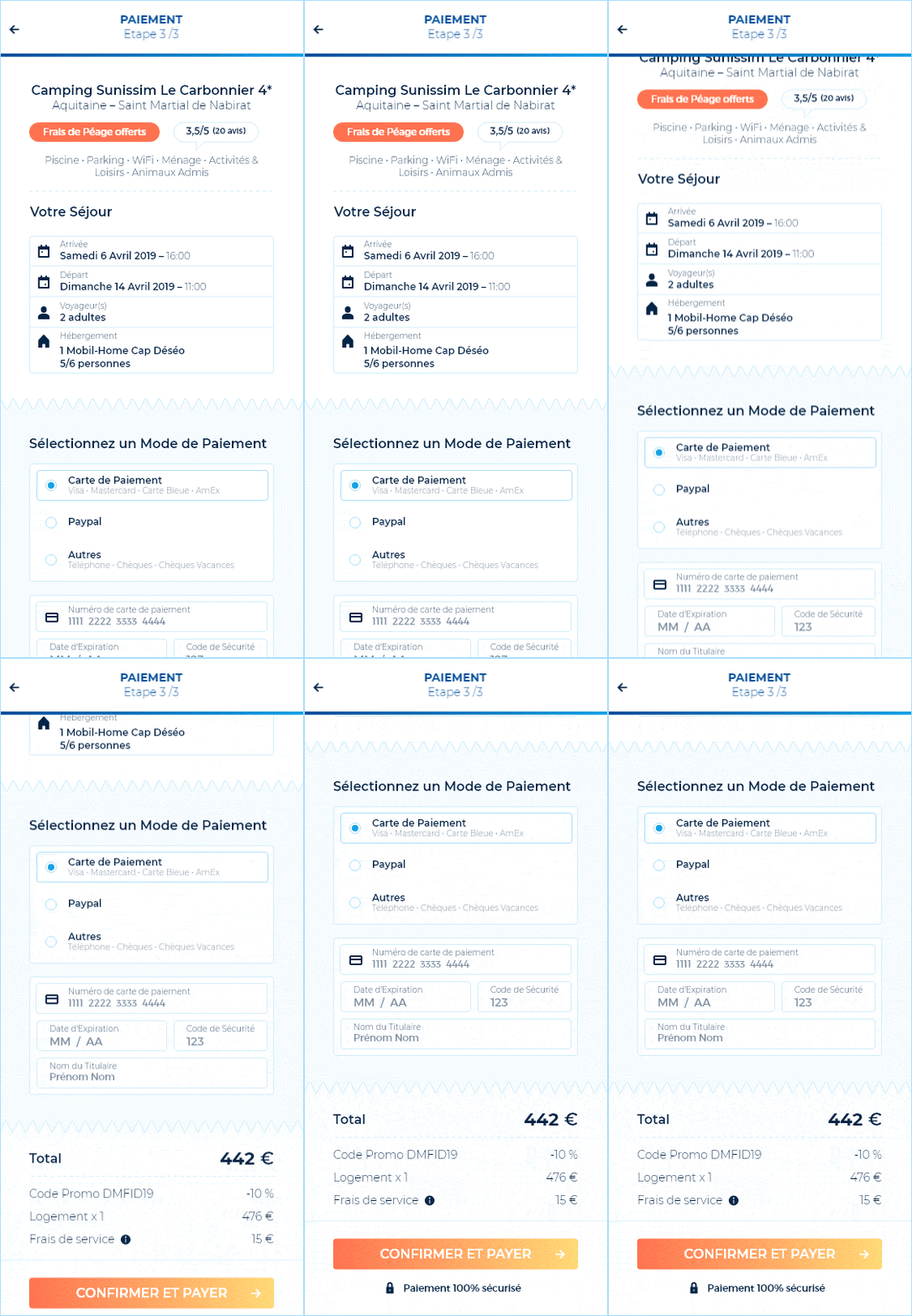
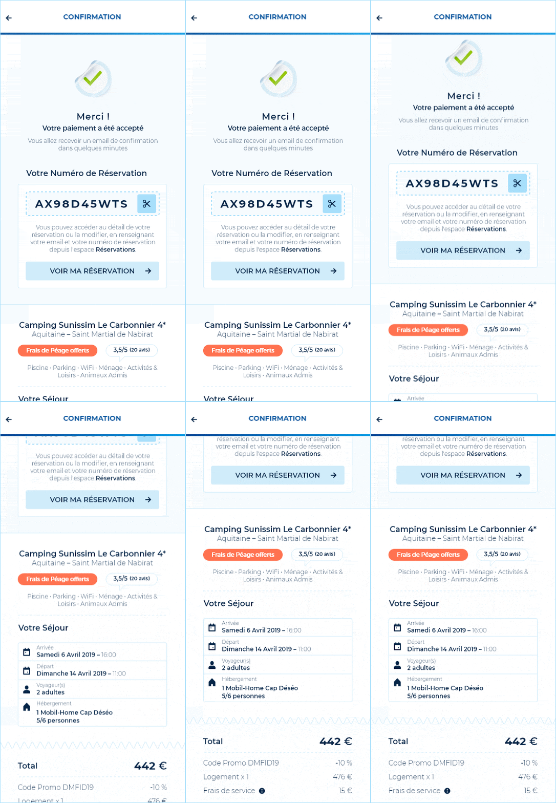
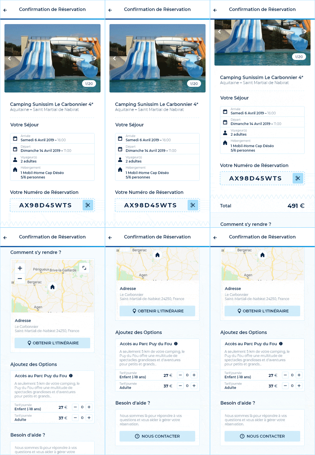
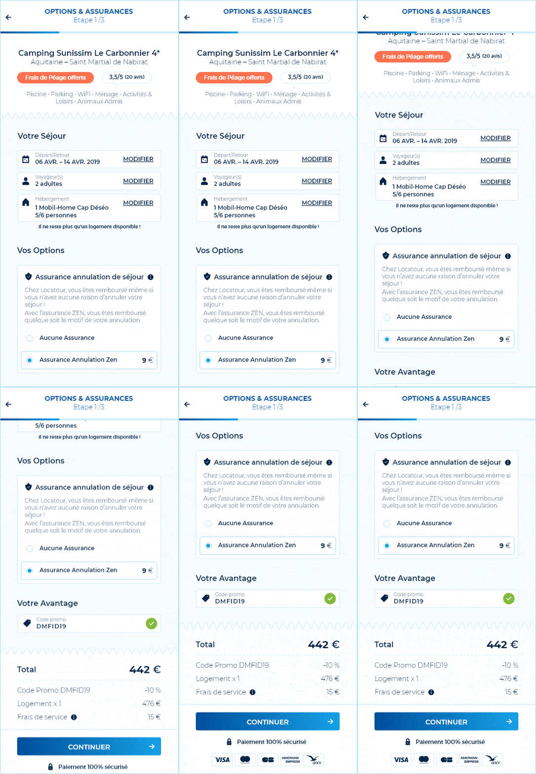
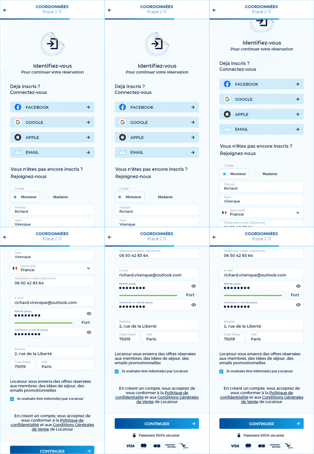
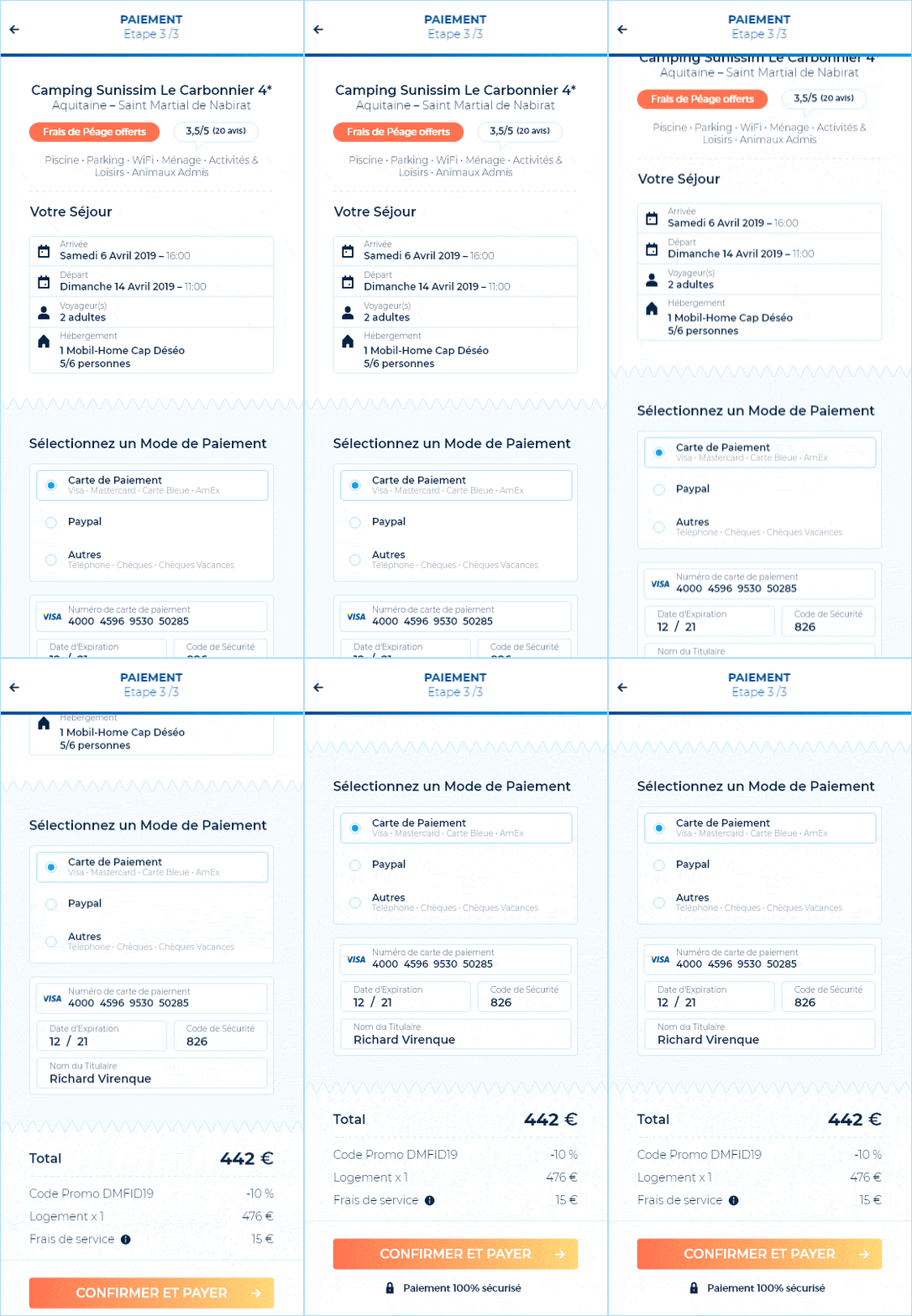
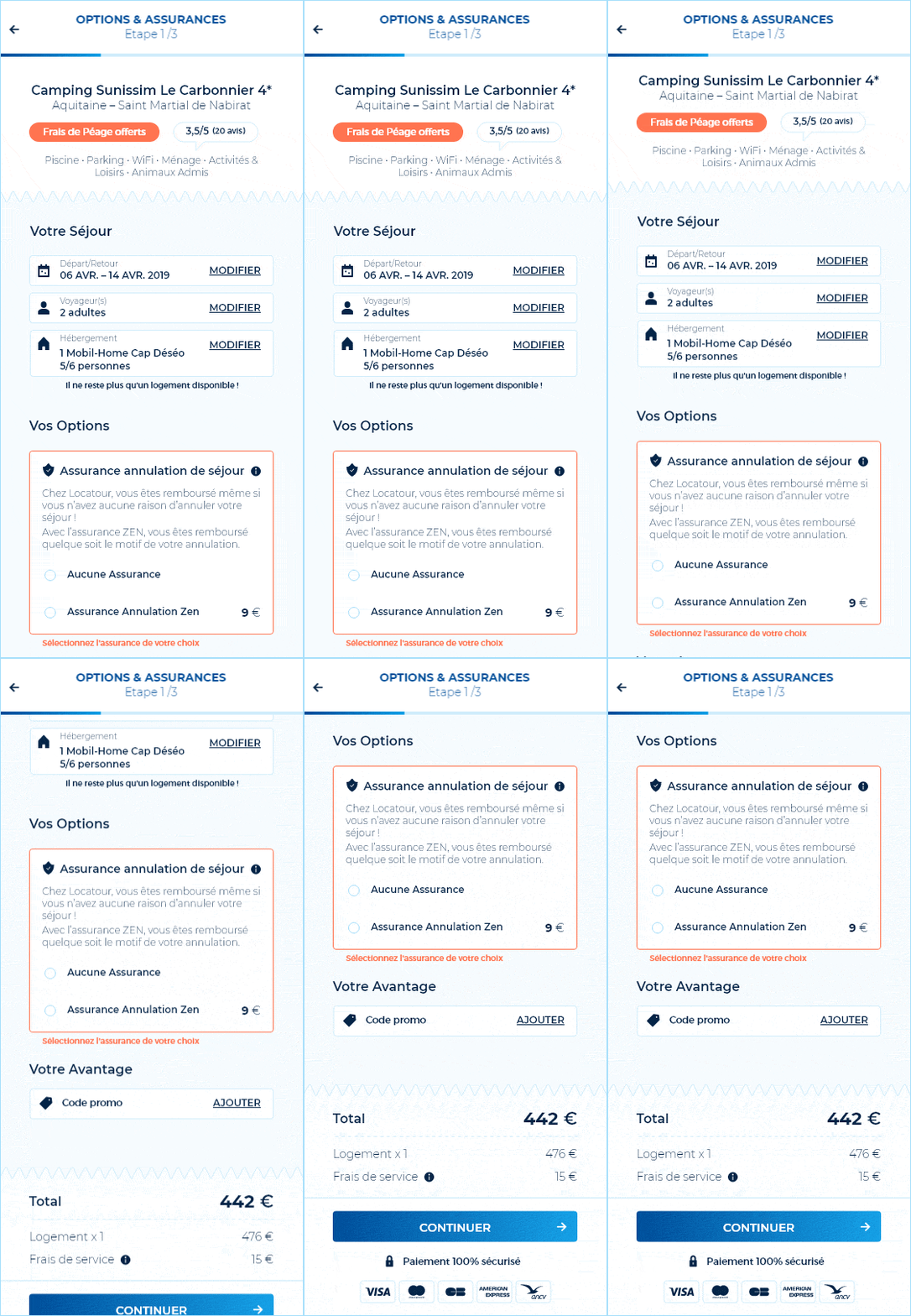
In this regard, the collaboration between all the internal Locatour's teams led to define KPIs Metrics. Part of my work on this project consisted in identifying every step of the user flow in order to improve the whole experience (Discover, Select, Book); an enhanced experience which involve an upgradable Design System to ensure smooth and friendly interfaces.
Design System
An Atomic & Minimalistic Approach
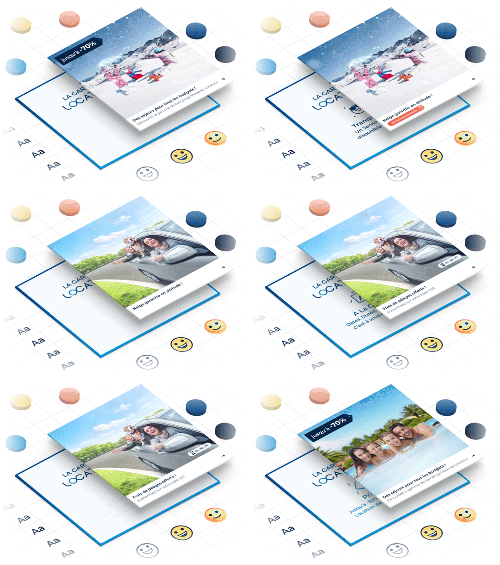
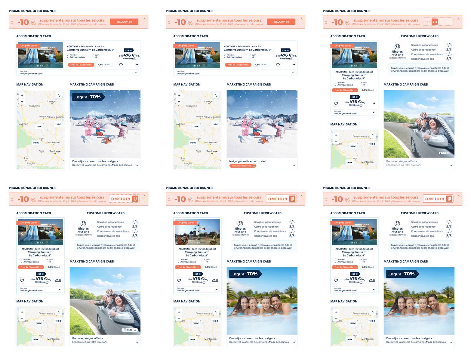
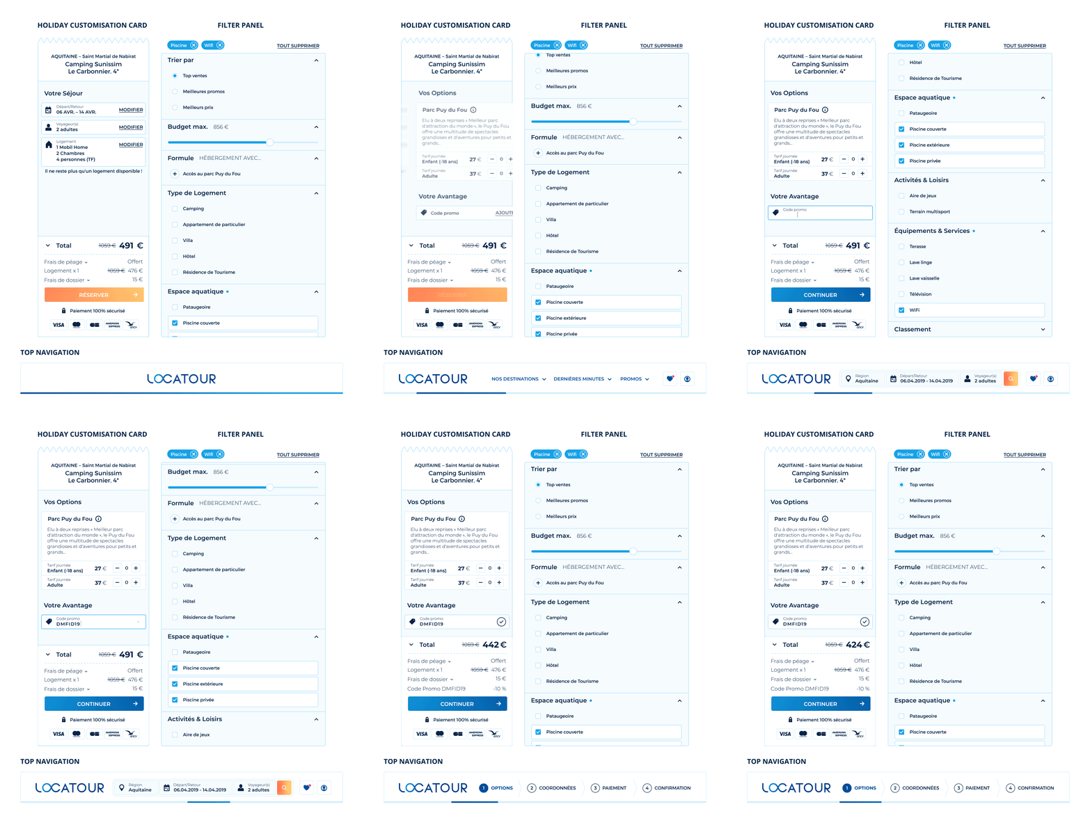
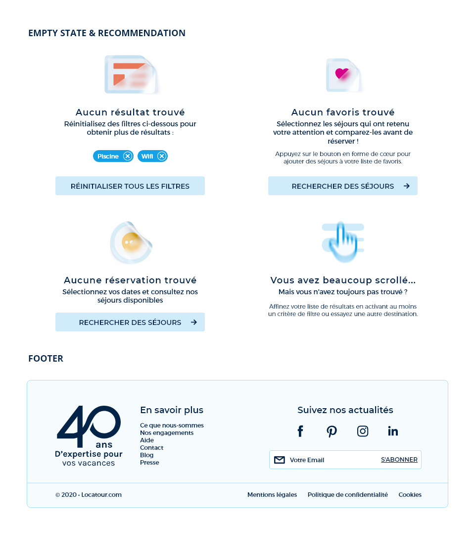
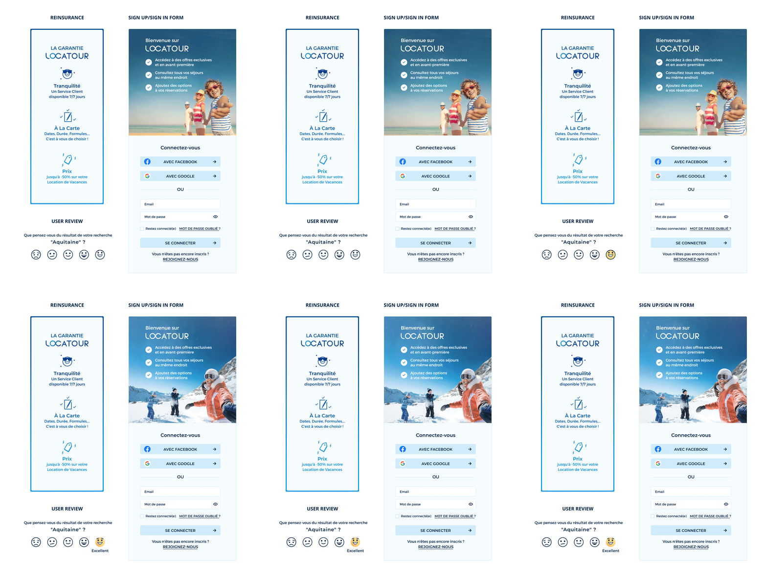
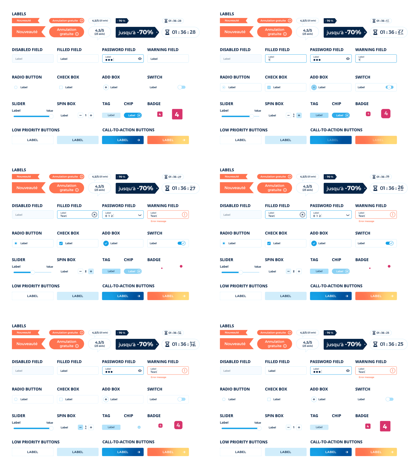
An interface is actually formed of many elements, all of which are connected to each other just like atoms in a modular environment. The new digital creation issues implies a scalable conception as content must be available immediately, everywhere across all devices. The atomic approach aims at standardizing content to ease user understanding and empower internal teams to collaborate more effectively. Along with this approach, a minimalist style contributes to lower pages loading and thus significantly impact metrics like page views per session and bounce rate.
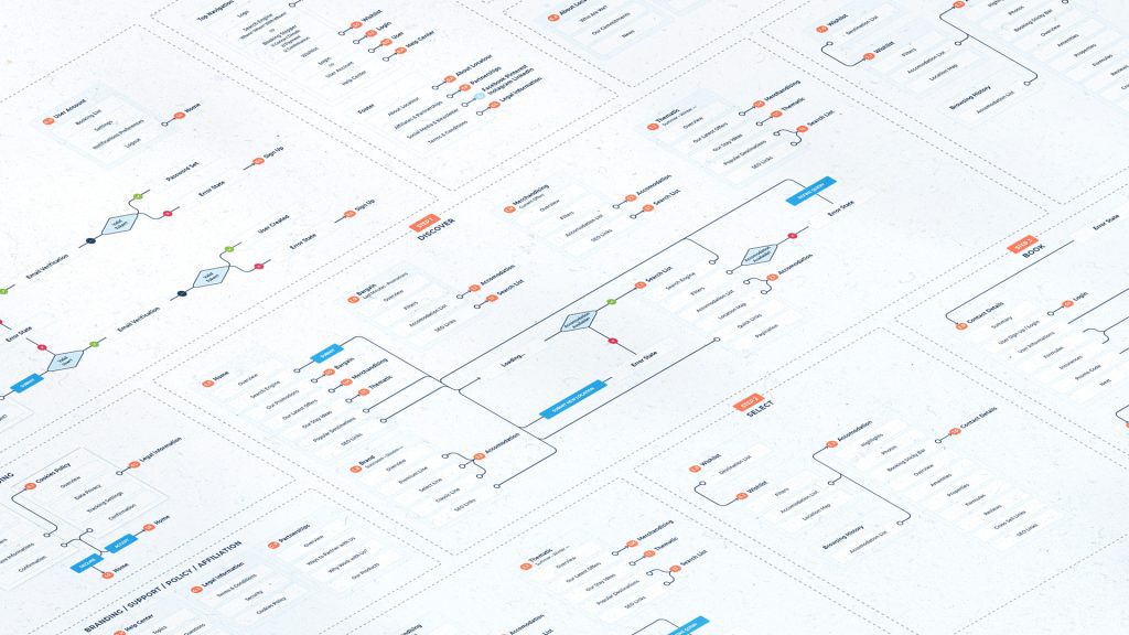
Step 1 – Discover
Simplifying decision-making
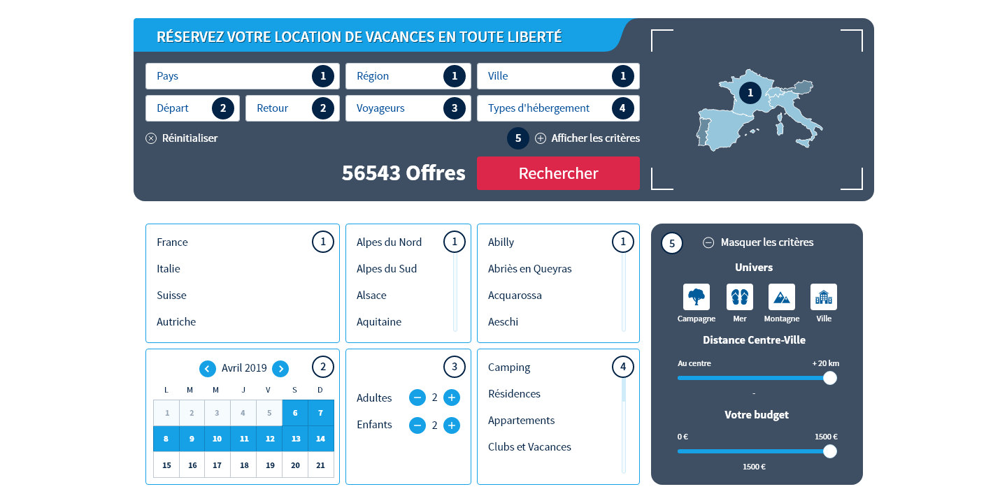
Exploring across 50 000 offers to select one single solution isn’t as obvious as one would expect. User is thus given the opportunity to choose between two opposite suggestions without any effort if not clicking on option A or B. This result in a high level of engagement.
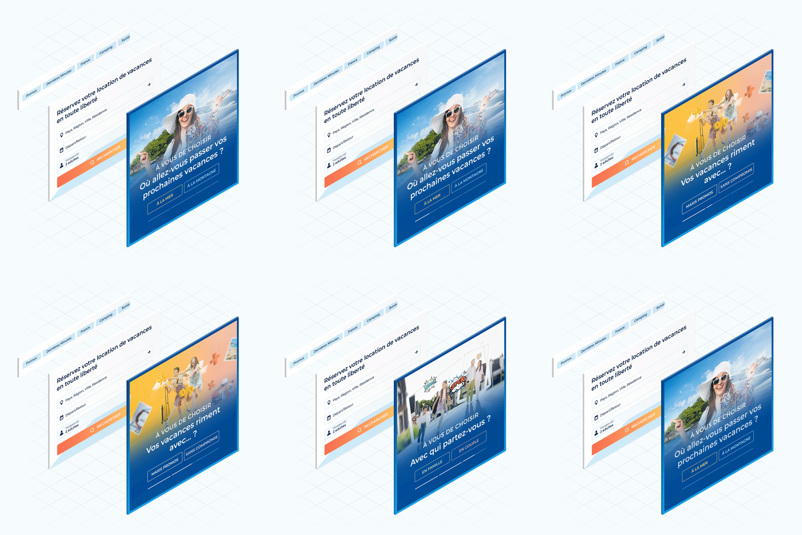
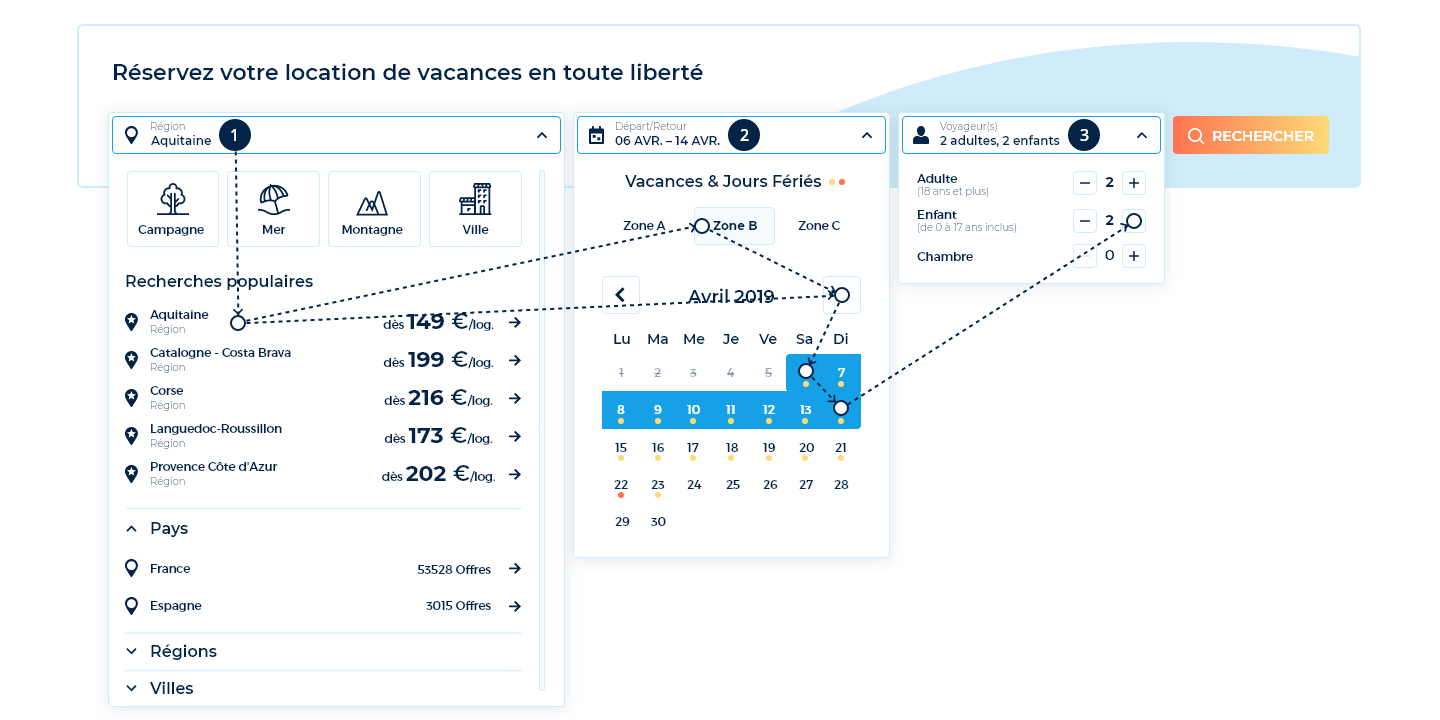
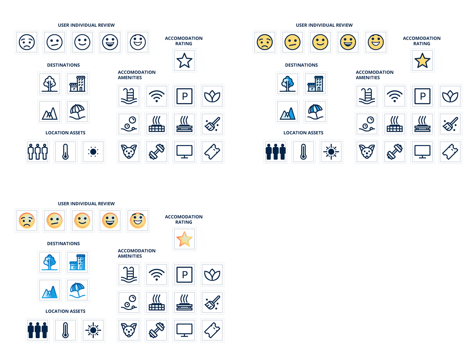
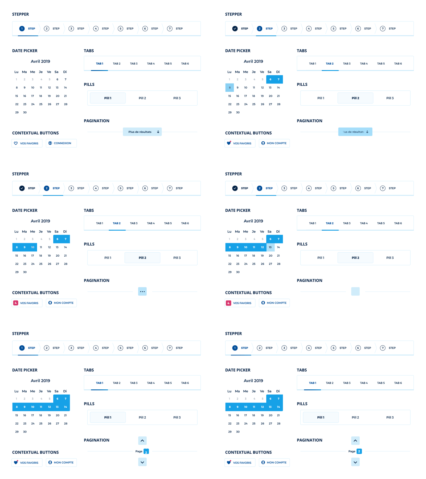
The new search engine is enriched with valuable informations including a list of popular places to go, pricing for each destinations as well as an overview of holiday’s plan inside the date picker component. All those assets were conceived to guide user in response to 3 initial questions : Where to go? When? With whom?
By prioritizing choices and presenting the right features, in the right quantity, at the right time, users are provided with the best possible experience.
Step 2 – Select
Fostering retention
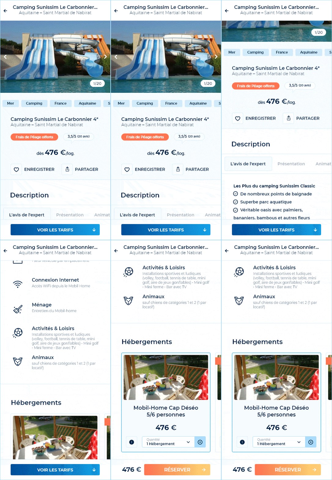
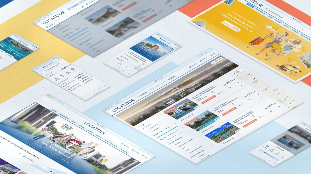
More than half of visitors don’t complete the transaction before leaving an online store. This statistic is even more meaningful in the tourism industry insofar as a customer integrates several criterias to further develop its thinking : evaluating a holiday’s budget, agreeing with partners, comparing offers… A thinking which involve numerous visits. To avoid wasting time re-entering previous research, it is therefore essential to allow users to continue their purchasing process in multiple ways.

Browse through History
In the destination field, some links ensure an immediate access to the search list matching previous criterias.

Add to Wishlist
In a dedicated space, it becomes convenient to accurately compare accomodations according to distance from the coast for example.
Contact Me
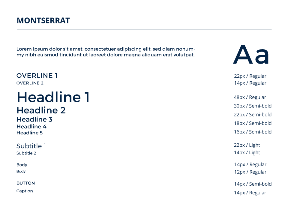
 Foundation .
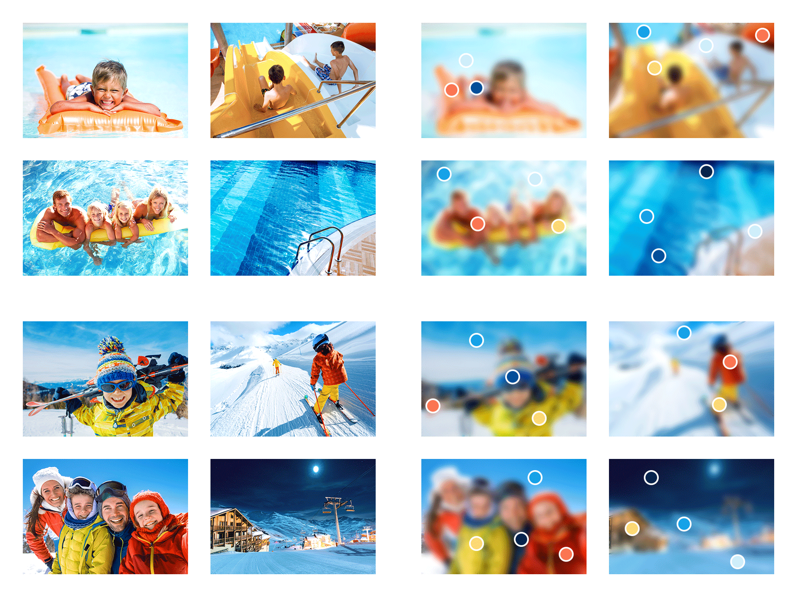
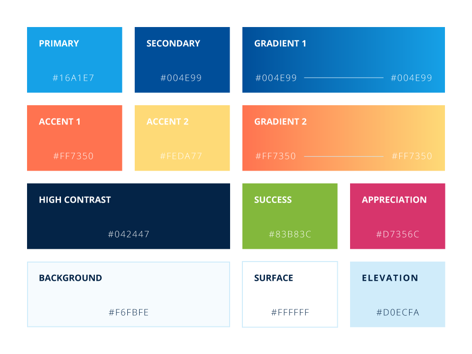
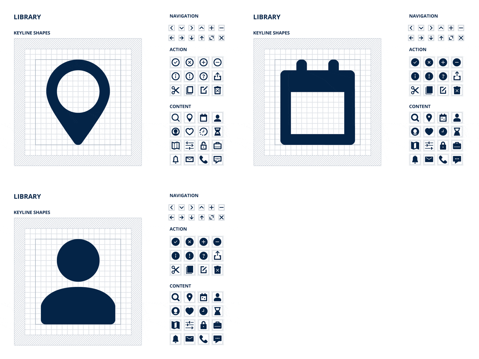
 Assets .


 Components .
 Patterns .