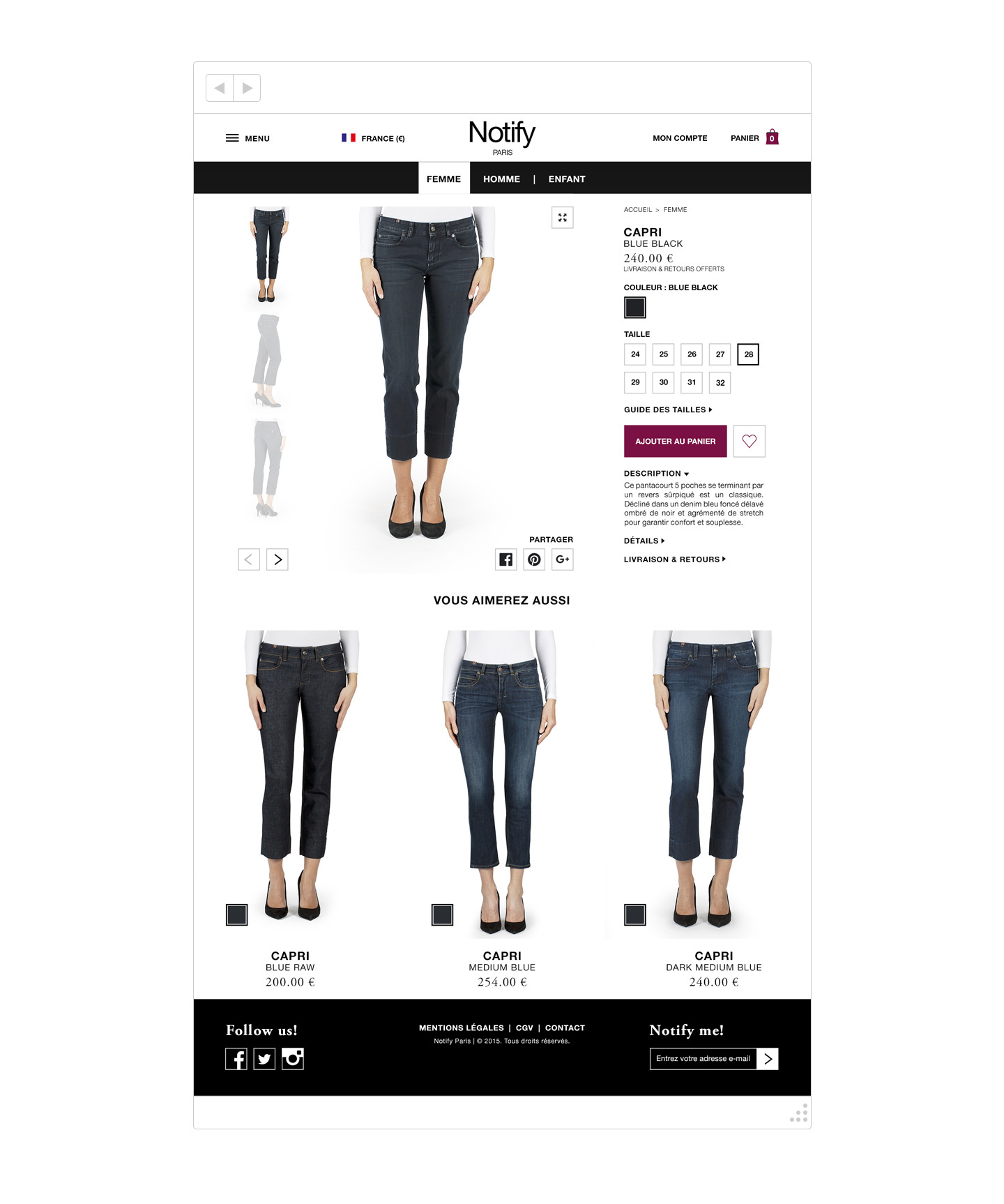
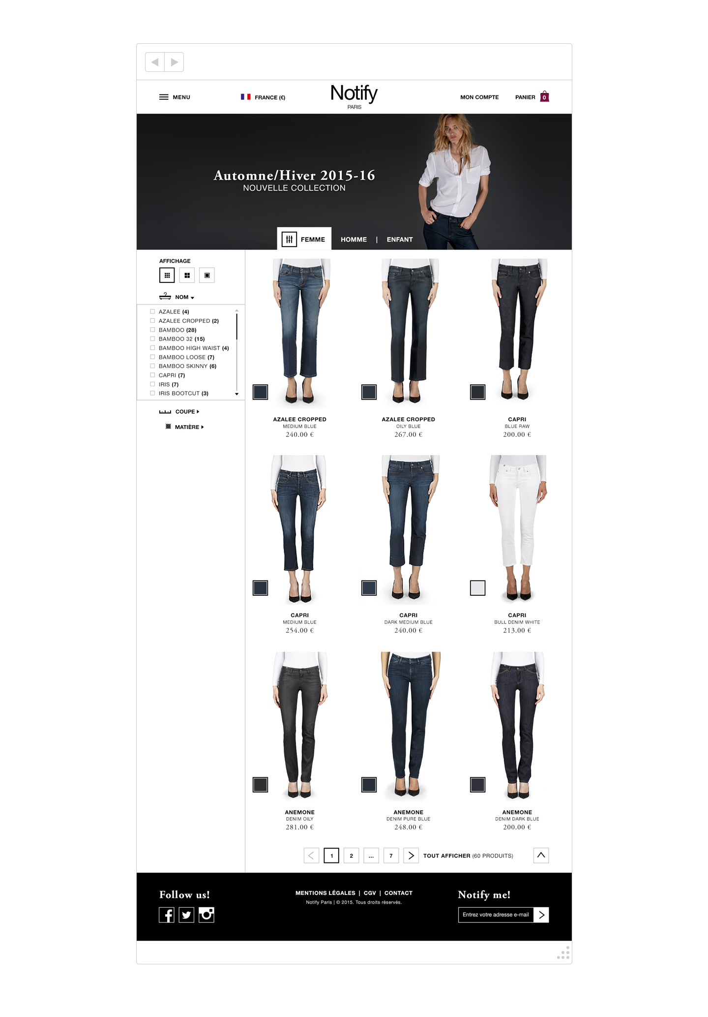
A High-endJeans Webshop
Atelier Notify has built its reputation on the high-end jeans market, thanks to the impeccable quality of its collections: expertly studied measurements, a palette of colors constantly revisited and exclusive finishes to each model.
In a sartorial and innovative spirit, I wanted to imagine what the e-commerce site would look like through its product catalog and its product sheet by focusing on the identity of the brand and its expertise.
A User’s centric interface
The brand targets a cosmopolitan and demanding clientele that intends to be recognized whatever its origins and habits.
How to meet their expectations?
By triggering a feeling of exclusivity with the consumer, by providing features that will facilitate their discovery of the products and trigger the purchase.
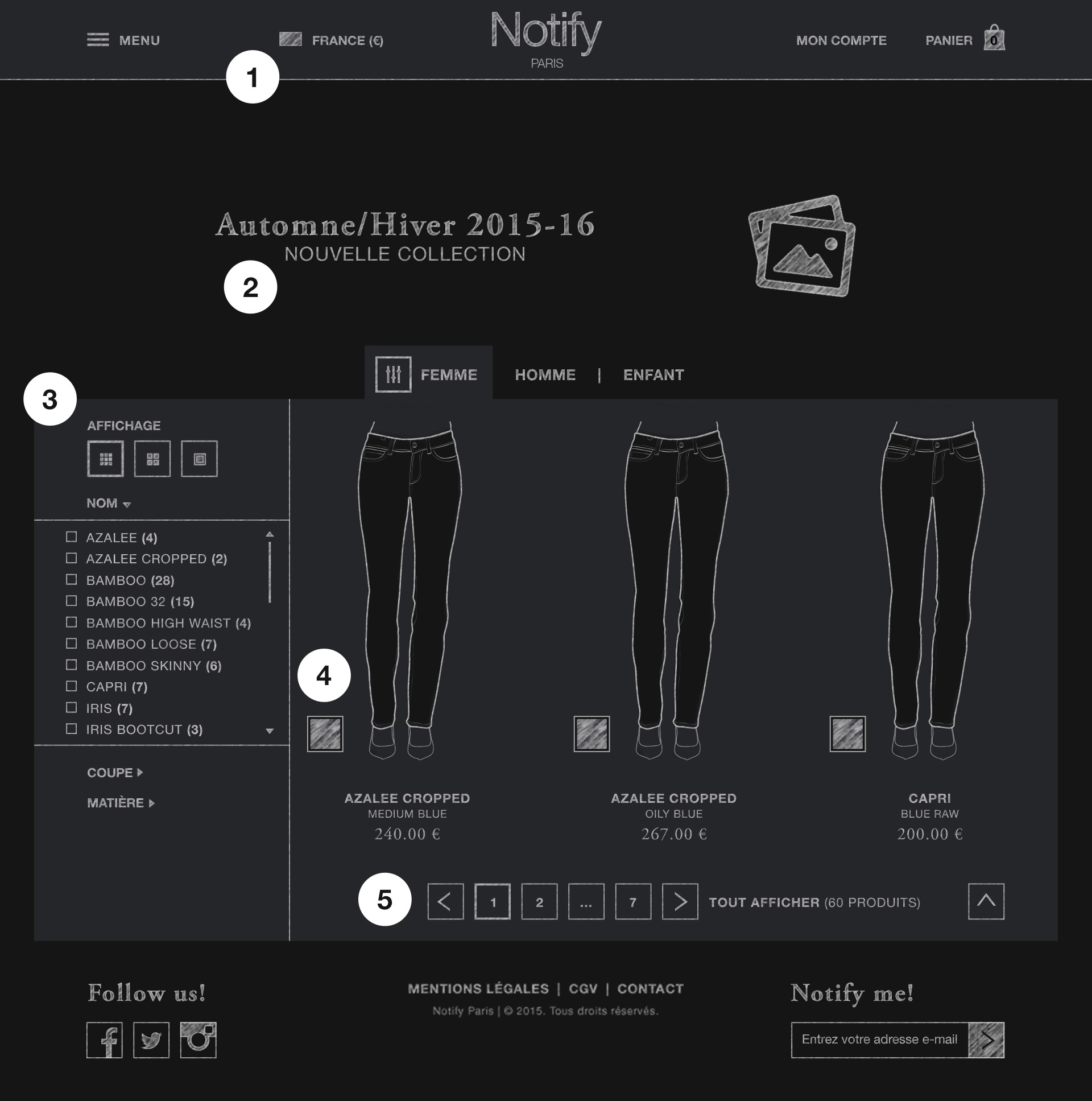
Product catalog
- Select your preferred language and currency
- Be aware of the current advertising campaign
- Display only articles according to specific criteria
- See the article in the different colors offered
- Browse the catalog from page to page, to a specific page or in its entirety
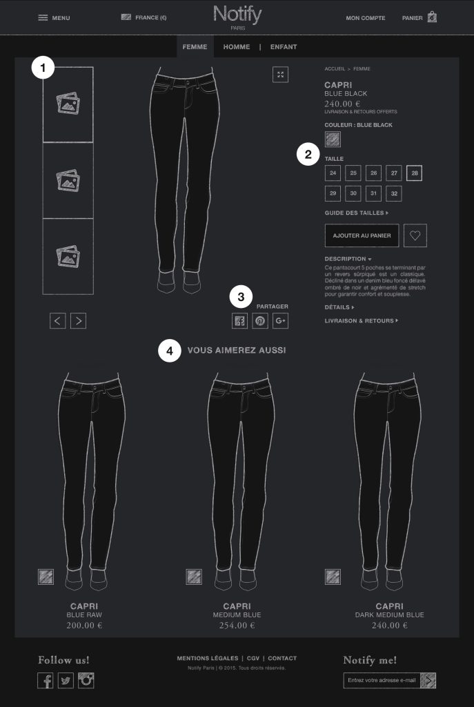
Product sheet
- Select your preferred language and currency
- Be aware of the current advertising campaign
- Display only articles according to specific criteria
- See the article in the different colors offered
A high-fidelity overview
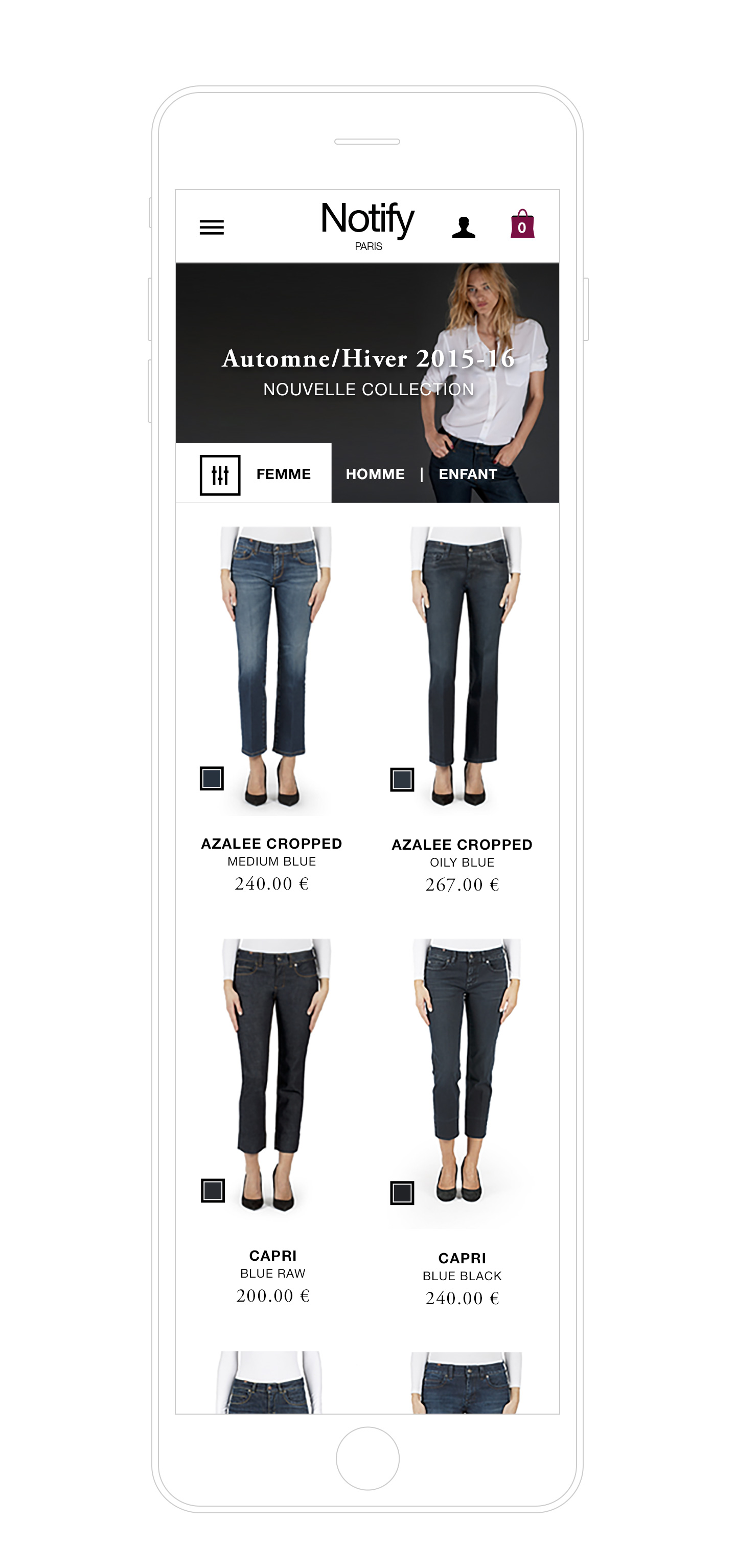
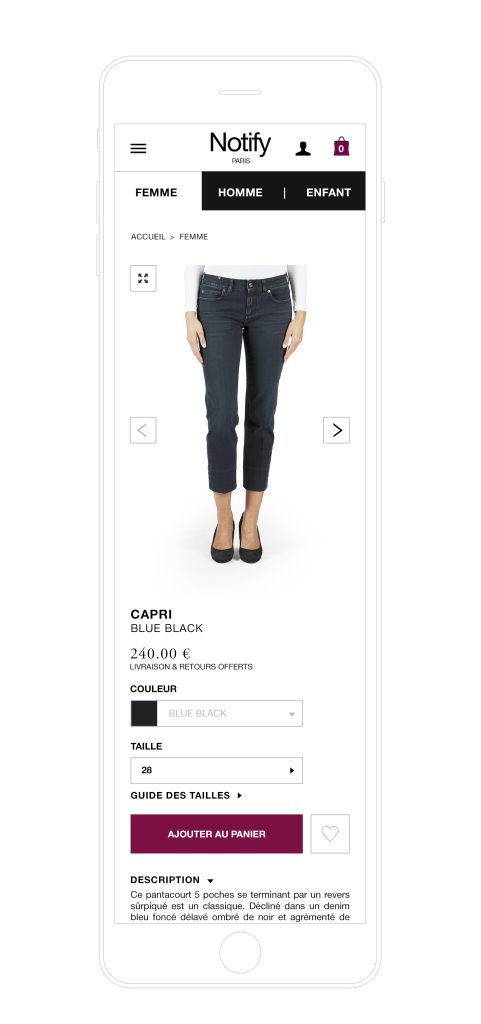
In a sleek interface devoid of all colors, the jeans models assert themselves in image as authentic and desirable products. The singularity of the jeans prevails over the price, which is presented slightly behind.
Mobile-friendly
The site is available on small-screen devices, while keeping all of the information succinctly or by alternative display options where appropriate.
Interactions for optimal comfort
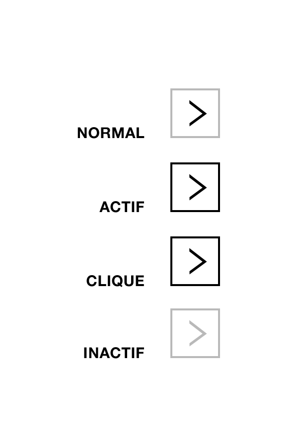
Buttons are large enough to be clickable regardless of the device used with the mouse, thumb or forefinger.
Navigation
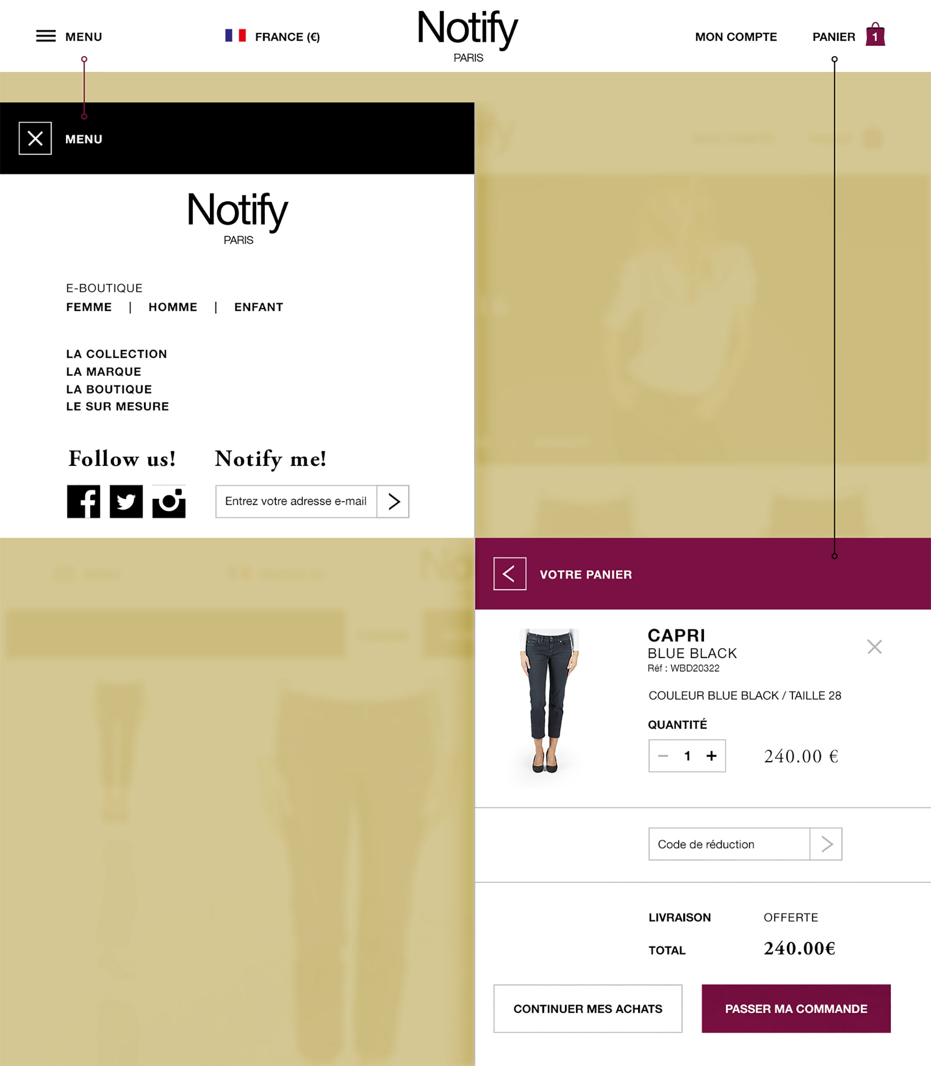
The navigation bar provides access to a set of links and options, which appear as a vertical pane.
Contact Me
